Picture this:
Emily, a dedicated painter from Baltimore, had always loved creating art inspired by the vibrant energy of the Inner Harbor and the city’s charming rowhouses. But for years, she struggled with her colors. Her reds sometimes felt too harsh, clashing unexpectedly, while her mixes often turned muddy. She couldn’t quite pinpoint why one red invigorated her canvas like a fiery sunset over the Patapsco River, while another fell flat and cool.<br><br>
That all changed when Emily joined one of my weekend color workshops a couple of years ago. Over those intensive sessions, we dove deep into hands-on mixing, exploring undertones, temperatures, and harmonies. By the end, something clicked, Emily told me it completely transformed her art and even how she saw the world. Her paintings gained depth, vibrancy, and intention. Colors no longer fought each other; they danced. “It took the mystery out of color relationships,” she said. “Now I paint with confidence, and my work feels alive.”
Emily’s story is one many of us can relate to. In our daily lives, color surrounds us: in the clothes we wear, the walls we paint, the ads we see, and even the food we eat. But how often do we stop to think about why certain colors harmonize while others clash? Even if you’re not an artist, understanding color is a superpower. It influences our emotions, decisions, and perceptions.
Take red, for example. We all know red as a “warm” color, evoking passion, energy, and excitement. But is every red the same? Absolutely not. Some reds lean toward a yellow undertone, making them brighter and more fiery, like a sunset orange-red. Others have a blue undertone, giving them a cooler, deeper vibe, almost like a rich burgundy. This distinction between warm and cool reds can make or break a design, an outfit, or even a room’s ambiance. Warm colors (reds, oranges, yellows) tend to advance and feel closer, creating vibrancy and energy, while cool colors (blues, greens, violets) recede, offering calm and serenity. Mixing these knowingly can add tension and interest, turning something ordinary into something captivating.
To visualize this, here’s a classic color wheel highlighting the warm and cool sections:
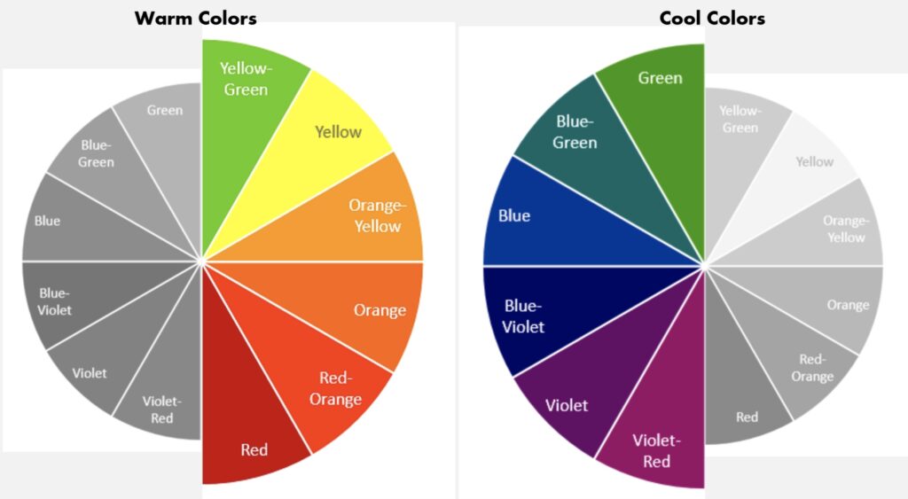
Notice how one side pops with warmth, while the other soothes with coolness?
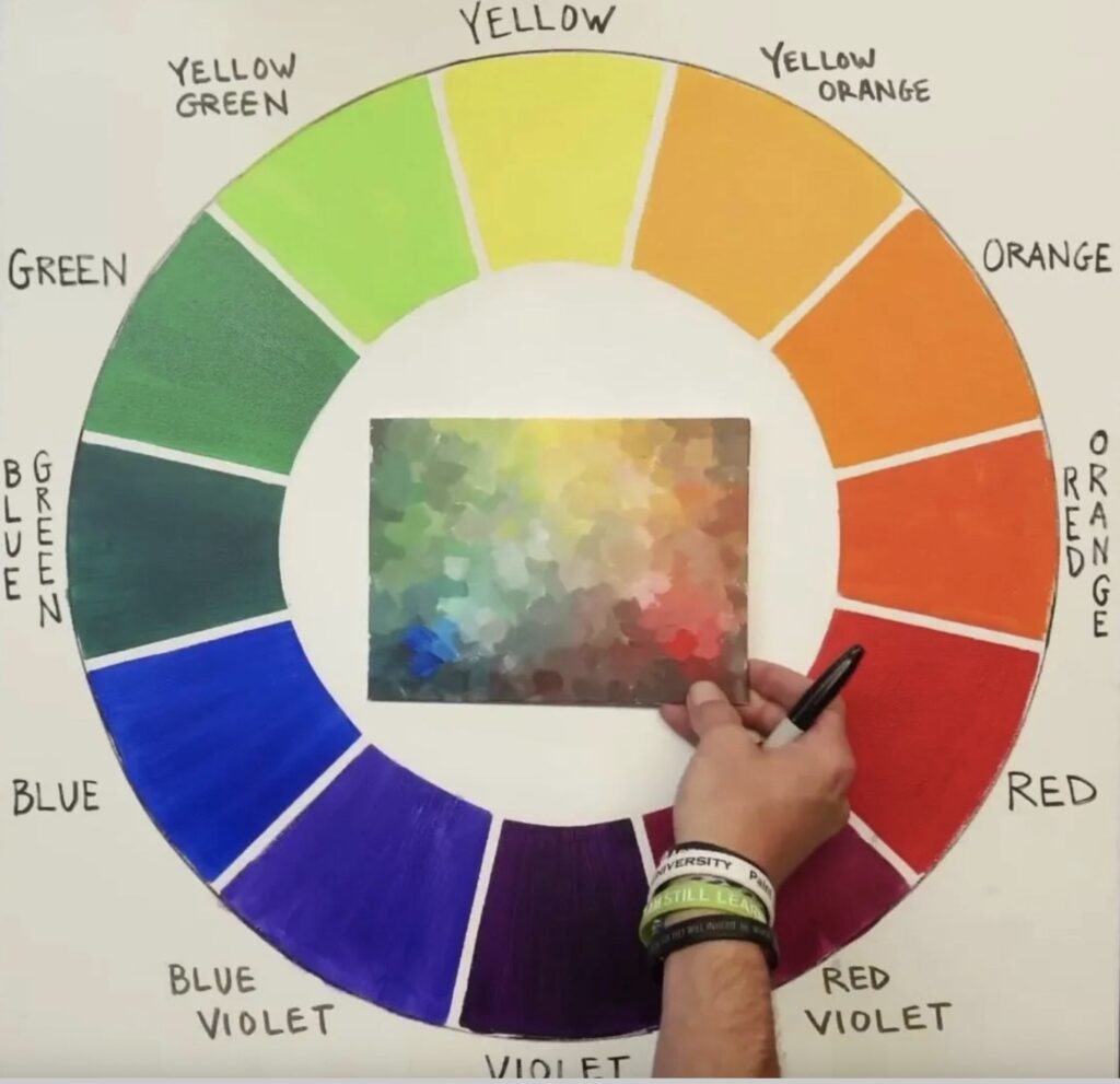
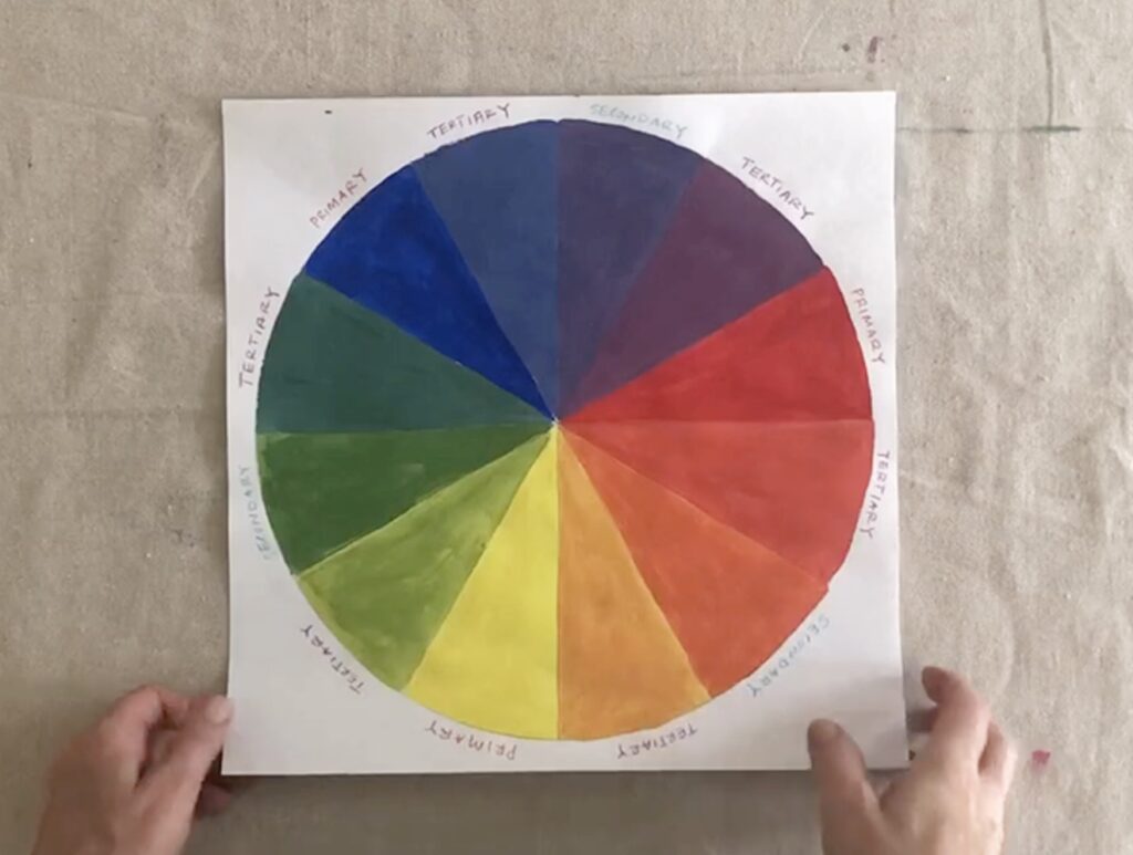
Why is hands-on mixing so important? Because it demystifies theory through practice. In my workshops, we start with primaries and build a color wheel, seeing firsthand how adding a touch of blue or yellow shifts a color’s undertone and temperature.
Here’s what the hands-on process looks like, mixing paints to create your own color wheel:
Now, I’m excited to offer a shorter, more accessible version: my Color Mixing Wheel Workshop on Zoom. In just 2.5 hours for about the price of a manicure, you’ll mix your own color wheel, explore these nuances like warm vs. cool reds, and take the mystery out of colors and their relationships. It’s hands-on, fun, and perfect for beginners or anyone wanting a refresher. No weekend commitment required; just an afternoon to gain skills that last a lifetime.
Emily’s transformation started with a deeper dive, but this condensed session captures the core essence, empowering you to see and use color differently, whether in your art, home decor, wardrobe, or everyday choices.
Ready to unlock your own color confidence, just like Emily did? Join the next Color Mixing Wheel Workshop and experience the shift for yourself. Sign up today, spots fill up fast!
More info and Registration: Thursday, January 22nd, 2026 from 1-3:30pm EST.

